
Simplify the Payment Terminal Setup Experience
Redesigned the payment terminal setup experience for Lightspeed’s Point-of-Sale (POS) system, leading the UX/UI design and collaborating with cross-functional teams across product strategy, user research, and usability testing.
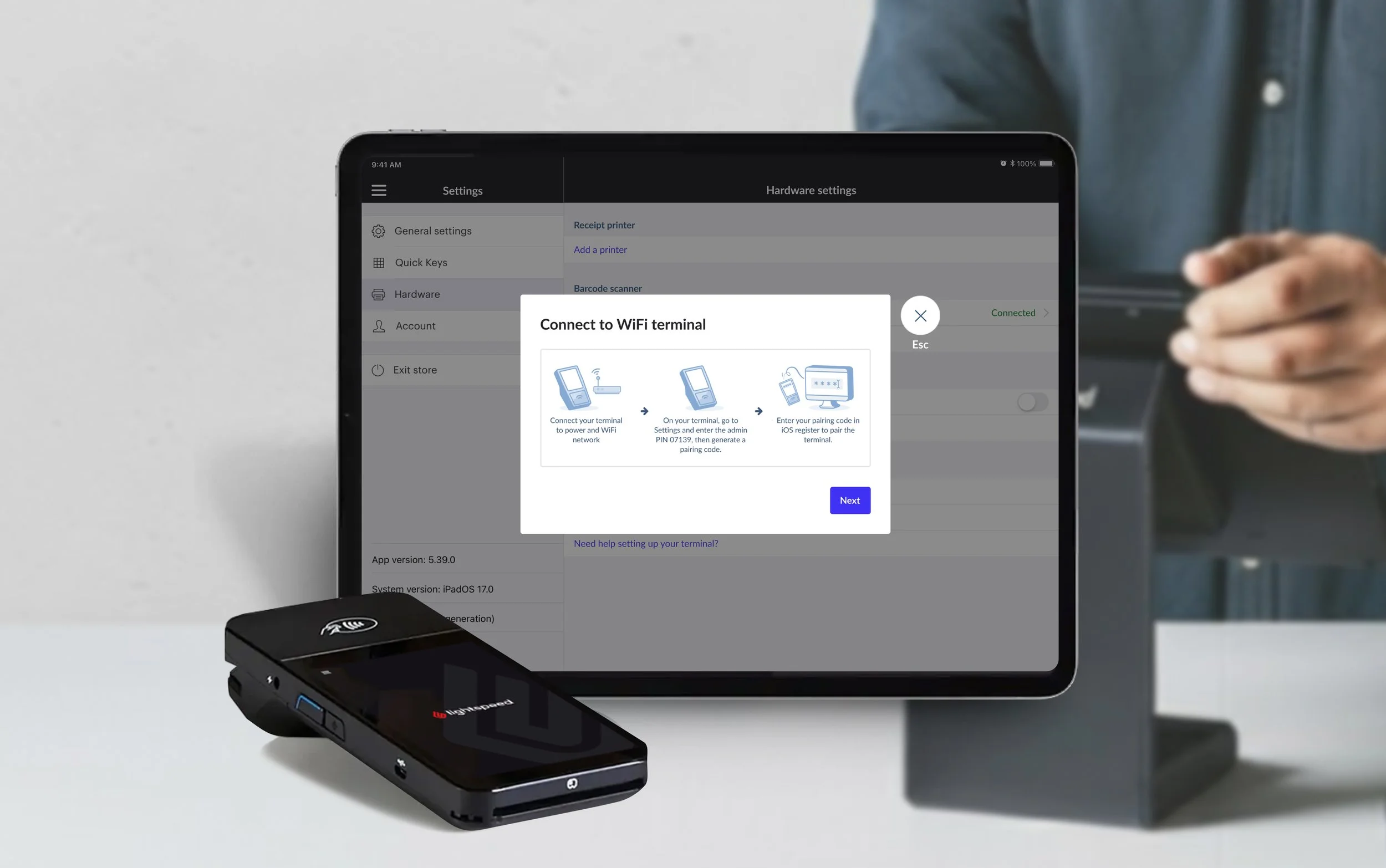
Project Info
B2B Project · 6 Weeks
The feature has been globally released.
Outcome
+26 percentage points
The proportion of retailers connecting their terminals within 60 minutes of their first attempt increased from 54% before the redesign to 80% in the first full week after release.
Deliverables
· User interview plan
· Usability testing plan
· Retailer journey maps
· Task flows
· iPad UI design
· Interactive prototype
Keywords
· Retail
· Payment Hardware
· iPad App
· Data-Informed Design
WHY DID WE DO IT?
Project ContextThe Onboarding Challenge
To accept card payments, retailers need to connect their payment terminal to their POS system and complete a first transaction. However, onboarding data showed significant drop-off before retailers reached this milestone.
The Design Opportunity
To support Lightspeed’s goal of improving the Payments onboarding funnel, we investigated why retailers were dropping off and identified opportunities to reduce friction in the terminal setup experience.
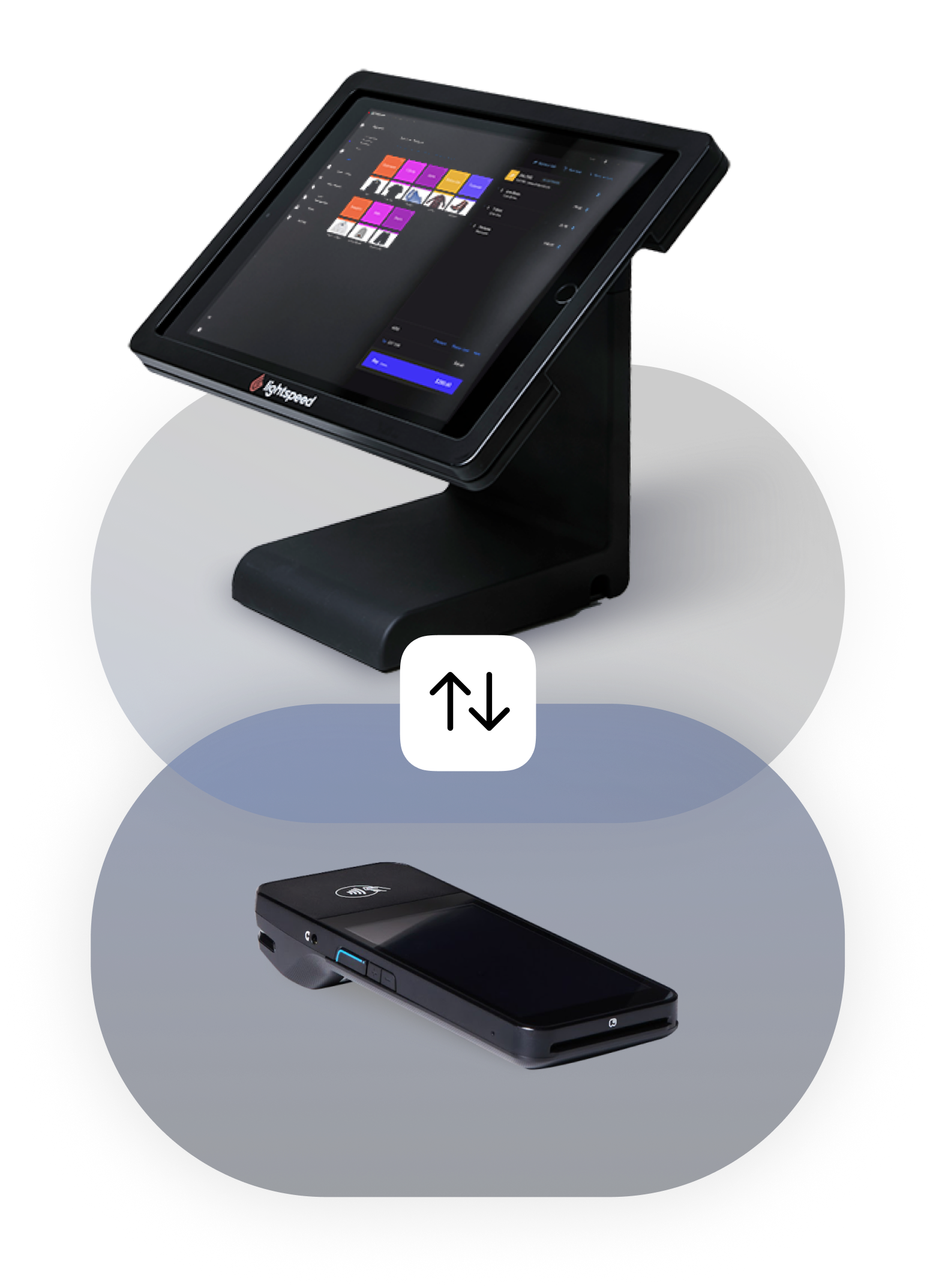
WHERE WERE RETAILERS DROPPING OFF?
Define the Problem & Scope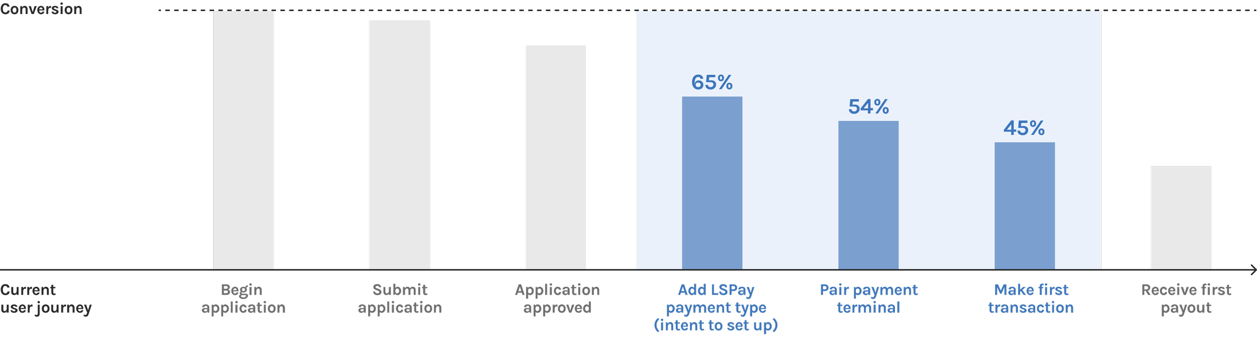
The Payments onboarding funnel showed a decline in conversion from 65% after retailers added Lightspeed Payments as a payment type to 45% at the first successful transaction.
Additional tracking data revealed further friction:
of retailers connected their terminals within 60 minutes of their first attempt.
54%
of retailers who attempted to pair on iOS never went on to use Lightspeed Payments on iOS.
18%
Together, these findings prompted us to investigate the terminal setup experience and identify specific usability issues that could be addressed through design.
Analyse The Usability IssuesWHAT WAS CAUSING THE FRICTION?
Insights from 8 internal usability tests and feedback from 10 retailers revealed 3 key usability issues, as shown in the flowchart below.
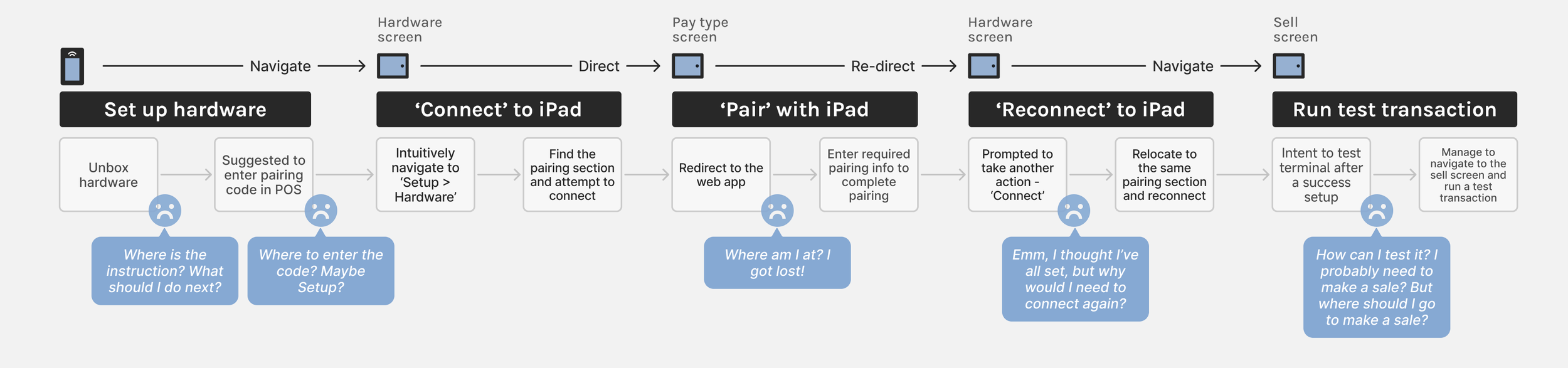
Disjointed Setup Experience
Due to technical limitations, retailers had to switch between the iOS and Web apps to complete different steps, making it harder to understand where they were in the setup journey and increasing the risk of confusion and drop-off.
No Clear Path to First Payment
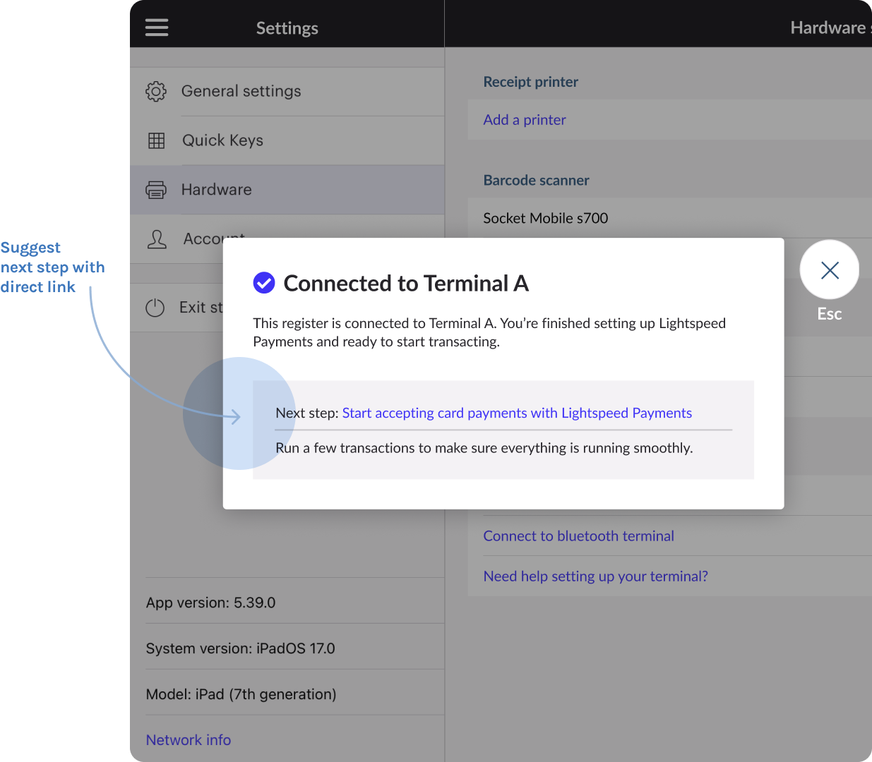
Completing the terminal setup did not naturally lead to the next goal: making a first payment, creating a gap between setup completion and the desired outcome.
Lack of Guidance
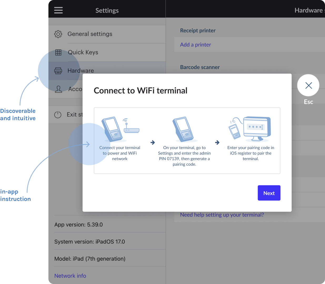
Upon receiving their new hardware, retailers had no physical or in-app instructions to guide them through the pairing process, leaving them to figure it out on their own.
Design Solution 1Make Setup Guidance Easy to Find
Bring pairing instructions directly into the iOS app under Settings → Hardware.
-
Internal usability testing suggested this was the most intuitive entry point. Placing guidance where retailers expected to find it makes the setup process easier to discover and follow.
Unify the Cross-Platform Setup Flow
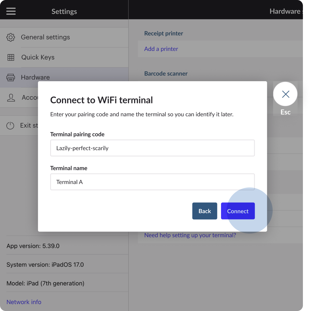
Design Solution 2Combine the previously separate Pair and Connect steps into one streamlined flow, reducing unnecessary navigation between platforms.
-
By redesigning the flow alongside technical updates, we created a more cohesive setup experience with fewer interruptions and less cognitive load.
Design Solution 3Create a Clear Path to the First Payment
Direct retailers to the Sell screen after a successful connection, encouraging them to complete a test transaction.
-
Rather than leaving retailers to figure out what comes next, the experience provides a clear next action at the moment of connection. This bridges the gap between terminal setup and accepting payments.
FINAL SOLUTION
See the redesigned journey in action, from terminal setup to the first payment.
DESIGNING FOR COMPLEX STATES & CONDITIONAL PATHS
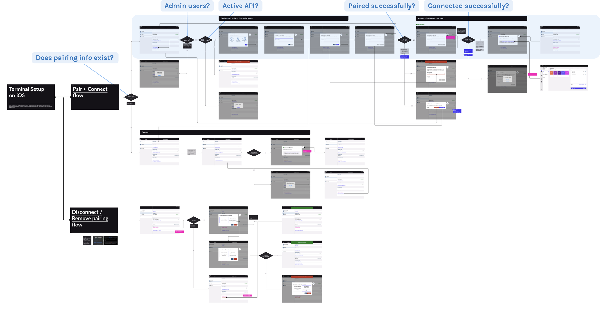
Design ChallengeTerminal setup involved multiple conditions, including user permissions, account activation, and the terminal’s pairing and connection status.
I mapped these scenarios into a comprehensive task flow, ensuring all key paths were accounted for and the experience remained consistent within technical constraints.
MEASURE BEYOND THE IMMEDIATE UX METRIC
ReflectionThe redesign achieved a +26pp increase in the proportion of retailers connecting their terminals within 60 minutes. However, connection speed is only one part of the broader Payments onboarding journey.
To understand the longer-term impact of the redesign, I would continue tracking downstream outcomes such as setup completion, first-payment conversion, and overall Payments adoption.